Start and layout
Starting the Forms editor
Editing a form is done in the Forms editor. The forms editor can be started from the WebHare Publisher websites or the WebHare Forms dashboard.
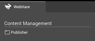
The Publisher application can be found in the WebHare start menu after logging in:
You can open the "Forms"- application by adding a new form or by opening an existing form.
Adding a new form
- Start the Publisher application and navigate to the desired folder.
- Choose "New file" from te menu or buttonbar.
- From the list of file types choose "Form" and click "OK".
- The Form file is created and the properties dialog is opened.
- Change the file name and/or title if desired and click "OK".
The WebHare form is created. The Forms editor can be started by by double clicking the file.
Editing a form
To edit an existing form you can open the file from the Publisher application:
- Start the Publisher application and navigate to the folder.
- Double click the form file or select the file and choose "File", "Open" from the menu.
The Forms editor is opened.
The application layout
At the top of the application you can find the buttonbar featuring the most used actions. On the right of the button bar the menu button is displayed. The menu contains all possible actions within the application.
- "Publish" saves and published the form.
The form will not be published (visible online) before you have performed this action for the first time. - "Save" saves the changes that you made without making them available online. You can also save changes to a published form - the unchanged form will remain available online until you replace it by publishing the changes.
- View allows you to view several versions; the published version (as visible to the public), the saved version and the version you are currenty working on, including changes you have made but not yet saved. You can also create a preview link to show to others while protectiging it from public view.
- "Add" allows you to add several items:
- Pages
- Groups
- Questions
- Text
- Handlers
- "Edit" allow you to edit the selected page, group, text or handler.
- "Delete" removes the selected page, group, question, text or handler.
- "Form settings" contains specific settings for the form, such as the retention period for collected data, spam checks etc.
- "Results" shows the collected results for the form.
PAGES AND GROUPS
A form consist of at least one page for the form and one "Thank you" page. You can add more pages for more complicated forms.
You can combine questions and texts into groups for presentation or to keep the form you're editing organized.
QUESTION
All fields that can be filled out by the visitor of the form are 'questions'. There is a number of set question types and custom question types may have been added for you. A question can only be placed in a group or on any page, except the overview page.
Read more in the chapter "Questions".
TEXT
Blocks of text can also be added to the form. These can consist of simple text or formatted (bold, italic, etcetera) text. Depending on the website your form is on, adding images or other components may also be possible.
Read more in the chapter "Texts".
HANDLER
Decide what happens when the form is submitted by adding one or more handlers, like sending the results to an e-mailadres and/or sending a summary to the form visitor: read more in the chapter "Handlers".
Questions
General properties
Some things can be set for (almost) all questions:
- The question itself; this field is required, because this is the question that is normally displayed in the form. It is also used while editing the form and displaying or exporting the results.
- Required: a question can be made required. The user will have to fill out the answer field or select and answer to continue or submit the form.
Required and dependencies
When you make a question required based on the visitors response to another question, the simple "Required" setting is no longer valid and will be disabled:
Presentation
Depending on the type of question, one or more of the following options may be available:
- Text before answer; placed before the answer field (can be used for currency symbols).
- Text after answer; placed right after the answer field (can be used for texts like 'Celcius' or 'persons').
- Example answers; this text is placed inside the answer field as a placeholder text. The text automatically disappears when the users selects the answer field or starts typing. It can be used to display an example phone number, IE "0800 0000". The example answer is not saved when the user does not fill out an actual answer.
- Display; by default both the question and the answer field are displayed. This option allows you to only display the answer field when desired.
- (Optional) explanation; contains additional information than can be displayed on hover, or when clicking a 'more info' button. Your form design must be configured to support this feature.
Validation
Depending on the question type several validation options are available. When filled out, the answer field is checked to see if it matches the set validation.
Dependencies
You can make several things depend on the answers given to another question using dependencies; based on what was answered before you can make another question, page, group, text or even form handler behave differently. Depending on the question and the type of item you can make them:
- optional or required
- enabled or disabled
- visible or invisible.
Using dependencies you can let the visitor skip (or not even encounter) unnecessary questions, or require more information based on the visitor's choice. For example: when the preferred method of contact is 'Phone', the actual phone number can be made required, and if 'No partner' is selected an entire 'Partner information' page can be hidden.
Short text field (single line)
A short text field allows the user to fill out a single line answer. This type of question is used for short, open-ended questions like company name or region. The maximum number of characters the visitor can type can be set.
Long text field (multiple lines)
A long text field allows the visitor to fill out a multiple line answer. This type of question is used for longer, open-ended questions like a remark or description. The maximum number of characters the user can type can be set.
An e-mailfield can be used to ask the user for an e-mail address. The answer is checked to see if it is a valid e-mail address. You need to add an e-mail question if you want to send the visitor their responses via e-mail.
Number
A number field can be used to ask for a numeric answer. A minimum and maximum value can be set.
Radiobuttons
Radiobuttons allow the user to select a single answer from a limited amount of choices, such as a yes/no question or gender. The question displayed to the left of the radiobuttons can be added, and you can choose whether the options are displayed next to or underneath each other (horizontally or vertically).
- For the radiobuttons at least one answer option needs to be added.
- You can set one of the answers to be the default selected answer.
- You can set an answer to be 'invalid' - when used in a required question, this answer would not satisfy the requirement. You can use this to create a 'Please choose' option or a 'I do not agree with the terms and condition'.
Radiobuttons or pulldown?
Radiobuttons support a limited amount of options - we recommend using a pulldown when there's more than 7 or 8 options.
Pulldown
A pulldown allows the user to select a single answer from a set amount of choices, such as a country choice.
- For the pulldown at least one answer option need to be added.
- You can set one of the answers to be the default selected answer.
- You can set an answer to be 'invalid' - when used in a required question, this answer would not satisfy the requirement. You can use this to create a 'Please choose' option.
Multiple checkboxes
Multiple checkboxes allow the user to check or uncheck one or more answers from the same question, for instance "Prefered contact methods". You can choose not to show the question, but only the answer labels.
- For the checkboxes at least one answer option need to be added.
- You can set which answers are selected by default.
- You can add an optional or required answer field to a checkbox; you can use this for "Other: please fill out".
Single checkbox
A single checkbox allows the user to check or uncheck a single answer option, for example "I agree with the conditions". For a checkbox a label can be set, which is displayed to the right of the checkbox. You can not add a 'question' field.
Date
A date question allows the user to pick a date, for instance a date of birth. A minimum and maximum can be set.
Time
A date question allows the user to choose a time. You can choose whether the time should be set in hours and minutes or hours, minutes and seconds by setting the precision to minutes or seconds.
Image
An image question allows the user to upload an image. You can use this to upload a profile photo.
File upload
An image question allows the user to upload an file.